Hello folks, and welcome back to Wrong Every Time. Today we’re checking out a new production, as we explore the long-awaited adaptation of horror mangaka Junji Ito’s Uzumaki, or “Spiral.” The acclaimed manga centers on the town of Kurouzu-cho, where some sort of spiral-oriented curse is steadily infecting the townsfolk and the landscape around them. In classic Ito fashion, Uzumaki wavers between eerie body horror and high-concept farce, treading the uncertain line dividing horror from comedy, and ultimately building a profound sense of entrapment and dread across its spiral-centered vignettes.
Whether Ito’s work can be translated to effective animation is another question entirely, and one that has been afforded some worrying precedent through prior adaptations like Gyo and the recent Junji Ito Collection. Conveying horror through the inherently affected medium of animation is extremely difficult; horror generally demands a sense of vulnerability, and an audience’s awareness that they are watching lines drawn on a page tends to undercut any aspirations in that direction. It is additionally the inherent wobbling nature of Ito’s linework, as if he’s scratching with the charcoals of a ritual fire, that often affords his stories such profound emotive power. Stack all that with his work’s tendency to strain suspension of disbelief even in its original medium, and you’ve got a mammoth task facing any prospective adaptation.
Fortunately, director Hiroshi Nagahama is an absolute master of tone, and has already proven through both his Mushishi and Flowers of Evil adaptations that he is literally the best horror director working in animation. If anyone can manage it, Nagahama can, and I’m certainly eager to see him try. Let’s get to it!
Episode 1
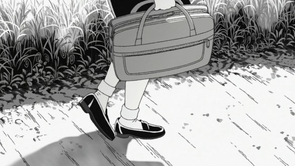
Our opening cut reveals multiple choices reflecting Nagahama’s distinct eye for managing tone through animation. First, the production is in black and white; Nagahama wisely understands that translating Ito’s work into color undercuts the stark, precise nature of his linework, and thus chooses not to. Secondly, he knows that atmosphere in animation must be all-consuming to be genuinely absorbing, with even this first cut demonstrating spirals in the roadside weeds, creating a sense of inescapable continuity that will surely define the feature. And thirdly, the animation of this character entering the frame is distinctly realistic, to the point of almost seeming rotoscoped – another tool for lessening the distance between animation and audience, which he exploited to remarkable effect through the Flowers of Evil
With the combination of realistic background art and black-and-white color design, our narrator’s town seems familiar yet alien, bleakly altered in the manner of something like Black Hole
Was this rotoscoped, with Ito character faces then superimposed over the filmed actors? The fluidity of movement is making me think so, making this a natural successor to Flowers of Evil
I like that the OP is just a spiral complimented by menacing, droning chords. Nagahama similarly understands the cruciality of an OP in setting a tone, while generally steering clear of the “offer a microcosm of the story to come” standard embraced by many OPs. Like Masaaki Yuasa, he instead creates an OP entirely dedicated to setting a specific mood, whether it’s the mournful, nostalgic tone of Mushishi’s openings or the menacing chant of Flowers of Evil
The OP resolves in the revelation that its spiral was actually the title itself, distorted far beyond recognition. A fine indication of the horrors to come
The fluidity of the character animation in terms of the number of redraws also feels distinctly Nagahama; obviously easier for this quasi-rotoscoping, but also reminiscent of how Mushishi’s spirits were specifically drawn on 1s (meaning a new drawing for every frame, or 24 per second), so as to emphasize their alien nature within their own world. Nagahama is always aware of how his medium’s fundamental variables impact the tone of his work
Our narrator Kirie greets her friend Shuichi, who has just returned to town
Junji Ito’s character designs work well for Nagahama’s style; he’s also seeking a sort of unmediated realism, in spite of his somewhat stylized eyes
Shuichi suggests they leave town altogether. “Don’t you feel it?”
Ito’s works strive for an all-encompassing sense of unease, which Nagahama is happy to accentuate through animation and sound design. Perhaps the only director I could imagine actually improving on Ito’s desired effect
Shuichi reflects on the spirals surrounding them, connecting this trend to his father’s strange behavior
The eternally fatigued-sounding Shinichiro Miki plays Shuichi, which actually fits nicely for Shuichi’s old-soul wisdom and paranoia
Black and white is definitely the correct choice for adapting Ito’s detailed draftsmanship. The horror is in the specificity of form, and naturalistic colors would muddle that
“Anyway, he can’t rest unless there’s a spiral.” Kirie’s attempts to emulate this “both eyes spinning independently” trick assures me that Nagahama understands fear and farce are two sides of the same coin with Ito – he is not afraid of pushing his concepts to the point of absurdity or even drawing attention to that absurdity, and a lesser adaptation would attempt to sand off this alleged contradiction in intent
And yet, it is precisely that acknowledgment of absurdity that allows Ito to carry his ideas so far. Self-serious horror can only sustain itself within a specific range of aesthetic invention; once you’re free to acknowledge the frequent complicity of horror and farce, you arrive at Malignant, or Suspiria, or, well, the Flowers of Evil
“I hate that gloomy sea. And that sinister black lighthouse.” In Nagahama’s stark adaptation, the lighthouse is free to be no more than a black tombstone on the horizon. Uzumaki leans so heavily on interpretation and distortion of basic form that a color adaptation would be inherently misguided
Back at home, Kirie discovers Shuichi’s father is regaling her own dad regarding the beauty of the spiral
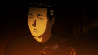
I like how this adaptation holding on specific “panels” for explanations actually increases the sense of unease relative to the manga. This uncomfortable partial closeup of Shuichi’s father explaining spirals would only last a moment when being read, but having to hear him explain his whole speech while staring directly into his eyes provokes another effect altogether
Unsurprisingly, this production’s soundtrack continues to bear resemblance to the Flowers of Evil, as well. Lots of slow, droning notes, ominous tones that slowly build up a sense of unease, refusing to conventionally dramatize and thereby sanitize the action
There’s certainly a little friction in the fluidity of these characters’ bodies versus Ito’s fairly stiff facial designs, but I don’t think that’s necessarily an unproductive effect, either
Kirie shares the news with her friend Azami, who seems to attract all the boys. Her design is quite close to Ito’s famed Tomoe
Shuichi can immediately sense Azami’s bad spiral vibes. This was also quite a funny dynamic in the manga, with Kirie initially attempting to enjoy a slice of life atmosphere while Shuichi freaks out about spirals every five seconds
“Kirie, you have to watch out. That girl is a spiral!”
Kirie delivers a spiral pot to Shuichi’s father, but he’s already on a whole other level of spirals. Nagahama wisely lets Ito’s big visual setpieces speak for themselves, adapting moments like this tongue-spiral as faithfully as possible
Azami hunts down Shuichi later, revealing her crescent scar has morphed into a spiral. This sense of general, implacable infestation is such a powerful effect; the spirals are a disease affecting reality itself, teasing our bodies and minds towards one incomprehensible result. It evokes cosmic horror in its almost accidental cruelty; there appears to be no malicious intent in this invasion, simply our world brushing against another possible version of reality
Shuichi begs Azami to escape this town before the infestation takes her entirely
We then cut to the funeral of his father, as his body is cremated and smoke rises from the furnace. A scene offering an immediate question of what exactly they didn’t want people to see
Shuichi reveals the story of his father’s final spiral. Even in this longer-form narrative, Ito constructs the drama like a series of folk horror stories, one vignette after another. His horror is often constructed around a disturbing core idea and one final visual punchline, a style which lends itself to short form storytelling more so than a long form drama
The smoke of his cremation forms a spiral that covers the sky. It’s as if the infection that consumed him is now dispersing across the entire town
Oh wow, the melting shape of Shuichi’s father in the smoke is really something. Love the texture of these drawings, which go even further than Ito’s lineart in evoking a sense of rough charcoal paintings
Our next check-in with Azami reveals her forehead spiral has extended deep into her skull. Ito’s body horror is superb, and part of its impact comes from how willing he is to stretch reality in order to maintain the illusion of normalcy in spite of his characters’ contortions – even as their bodies are distorted beyond recognition, they still insist that everything is fine
It calls to mind a terminal disease or addiction, the horrible elephant in the room
Back at school, the damp, grotesque Katayama arrives late. Ito’s very good at designing these frog-men, calling to mind Lovecraft’s descriptions of those caught in the sway of some unearthly deity
Katayama only comes to school when it rains
He is dragged out of the locker room naked, revealing the spiral on his back. The vignette implies a manic ferocity infecting the students, as they descend into panic and cruelty
Gyaaaah, the sound design for Shuichi’s mother cutting off her fingertips is so awful! Incredible evocation of horror through foley work here, making this moment hit with far more impact than in the manga. Fuck, I think Nagahama’s done it – between the pacing, sound design, and art direction, this might actually be the definitive Uzumaki, a genuine improvement over the manga
And now Azami’s head is roughly half spiral, so fully developed it consumes her right eyeball entirely. Horrific spinning effect as the eyeball drifts into her skull
Her movements are made unnaturally smooth as she approaches Shuichi, again capitalizing on that disturbing contrast of animated fluidity
A final, grotesque setpiece, as Azami is consumed by her own spiral
And Done
Holy shit, Nagahama’s done it! I genuinely doubted that Ito’s work could be adapted into animation while maintaining its power, but if anything, Nagahama’s ornamentation here actually amplifies the impact of the material, with his sound design and animation direction making for an entirely all-consuming aesthetic experience. Uzumaki is distinctive and effective as a manga, but it is genuinely revolting in animated form, and I mean that in the most complimentary way possible. The eerie soundtrack, the off-puttingly smooth animation, the stark background scenery, the grotesque foley work… this first episode impresses on all fronts, and has shifted my interest from idle curiosity to an absolute need to see the rest of it. Congratulations, Ito and Nagahama – your spiral has drawn me in.
This article was made possible by reader support. Thank you all for all that you do.


