Hello friends, and welcome back to Wrong Every Time. I recently received a request to write some sort of “sakuga article,” meaning an article relevant in some way to the exemplary individual cuts of animation we anime stalwarts refer to as “sakuga.” This has been a source of some consternation to me, as I don’t generally consider myself particularly studied or well-informed when it comes to the specific craft of animation in the abstract. I know enough to describe why a cut feels evocative or impactful to me, but my specialties are first and foremost writing-related, followed by filmic technique, with animation following behind.
Nonetheless, I have come to an uncertain understanding with the fact that if people want me to write something, they’re generally going to be amenable to something written in my voice, from my own perspective. And I can certainly talk about how animation has made me feel, how I consider the various trends in modern animation, and what cuts of animation have felt most important to me. In fact, I would say there’s definitely room for more adulation regarding many styles of brilliant yet underappreciated facets of animation, particularly given the general trends of anime fandom.
When most fans think “sakuga,” they are likely to be thinking of action cuts – those ferocious sequences from Jujutsu Kaisen or One Punch Man or even Neon Genesis Evangelion, depicting titanic figures in desperate, violent conflict. Action is often framed as the default vector for animated excellence, owing to both the inherently action-oriented fascinations of the medium, as well as the simple fact that action is drama created through movement, being therefore a perfect vehicle for storytelling in a medium whose fundamentals are defined by wordless motion. Fans orient themselves relative to their favorite characters via those characters’ methods of expressing force upon the world, and the exhilaration of seeing a favorite character’s grace and power expressed through beautiful drawings is indeed a wonderful thrill.
But we’ve got plenty of knowledgeable people within fandom praising the action cuts of top animators – hell, even my own article about Akihiro Ota’s animation was largely centered around his approach to action scenes. As such, today I’d like to broaden that perspective a little, and explore how animation can be uniquely effective in articulating other types of emotional drama. Animation’s simultaneous precision and variability of form, its ability to capture precise details of visual nuance and tether such details to exaggerated, melodramatic alterations of character design, means it is uniquely effective at depicting an expansive range of experiences, expressing both the minute, memorable details and personal, felt experience of practically any moment you could imagine. Let’s celebrate just a few of those moments today.
One Piece: Luffy’s Despair (Ryo Onishi)
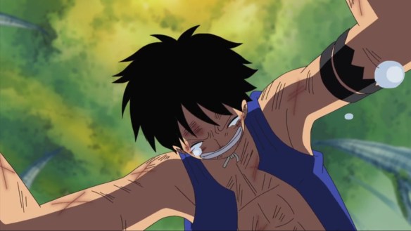
In a franchise that has recently been defined by extraordinary feats of action animation, my favorite cut remains Ryo Onishi’s depiction of Luffy’s despair upon losing his crew. The key concept being conveyed here is “strength and passion with no outlet,” and Onishi captures that perfectly, setting the ground itself as an antagonist that Luffy cannot hope to defeat. Erratic shifts in energy are captured through minimal movement, as if Luffy is balanced between revving himself up and falling into despair – a contrast embodied through the moment of him attempting to race against the ground before tripping and falling, only to then test if his skull can break the earth.
All of this aligns to convey the horror that One Piece’s past several episodes were pointing towards: the drop in your stomach when you realize all your efforts were not enough, that this is the end of the line, and that no desperate ploy or bargaining can return what has been taken from you. The lack of character shading and flat background only amplify the effect, presenting Luffy as an unvarnished vessel, as boyish and weak as he has ever been. When I consider unthinkable loss, in all of its ugliness and self-destructive denial, I think of Onishi’s beautiful articulation of Luffy’s once-imposing, now-frail body pointlessly punching the earth.
Sound! Euphonium: Kumiko Starstruck (Kunihiro Hane)
An obvious choice, I know, but hard to beat when it comes to displays of an emotional, felt experience purely through animation. It is easy to say someone is entirely dazzled by another’s presence, or to depict their expression in the wake of being so dazzled, but it is much harder to actually articulate the experience of that moment, to embed within your imagery the sensation that the character’s emotions are provoking within them. And Kumiko suddenly realizing she is utterly enraptured by her bandmate Reina is an extraordinary example.
Admittedly, this one doesn’t come down to the animation in the abstract. Kyoto Animation’s unparalleled post-processing team do a remarkable job of making this moment feel like an angel suddenly revealing herself, employing the streetlights and passing cars to fringe Reina’s hair with a halo of light, create a shimmering backdrop of bokeh, and simulate camera flashes like she’s a runway model through the convenient spacing of passing cars. But none of that would work if not for Kunihiro Hane’s careful attention to how the fall of a character’s bangs can frame or disguise their face, or the graceful transition of emotions from Reina’s downturned, accommodating smile, to her proud, almost defiant eye contact, and then to a jaunty head tilt, as if Reina is inviting Kumiko in on some amusing secret. A perfect fusion of animation and lighting after-effects, where every modification of the original drawings is intended to amplify and celebrate their underlying power.
Rainbow Fireflies: The Weight of Time (Shinji Hashimoto)
In a film that’s generally brimming with gorgeous feats of character-rich animation, Shinji Hashimoto’s depiction of a conversation between a young boy and old man on the brink of their village’s destruction is absolutely my favorite. In their exchanges, the weight age impresses upon us is expressed physically, clear in the heavy, pronounced movements of the village elder, and in the confidence bordering on fatalism with which he stares onward into the darkness.
In the boy’s hesitant movements and unstable form, an aesthetic of innocence is made equally tangible. His chin is tucked in, eyes wide and fearful, posture defensive – all points lead into himself, conveying without words his fear of the dark, his wonder at the unknown. And the blocking is equally purposeful – the boy is forever looking up and outwards, catching only the edge of his companion’s face, the noble yet receding strength of his hard-set jaw and proud nose. The boy’s form is fluid, his shirt fluttering, his eyes recognizing but not fully understanding the sadness beneath his partner’s words. In this sequence, age and innocence communicate with perfect visual clarity, captured in fluid yet perfectly chosen lines.
March Comes In Like A Lion: Rei’s Frustration (Yuya Kamagai)
Having defeated an opponent absorbed in self-pity regarding his mediocre shogi fortunes, our protagonist Rei at last erupts, racing to an empty park so he can scream his frustrations into the void. If you want to succeed, why not practice harder? How is Rei to blame for your unhappiness, when shogi is the only thing in the world he’s any good at? Why should he feel bad about winning, why is it shameful to care so much about this game we both clearly adore?
Rei’s movements are short, abrasive yet passionate – even as he lets loose his full frustration and resentment, he still tucks his body tightly, like there’s a coal burning at the pit of his stomach, like even in his rage he’s still ensuring he doesn’t take up too much space. Closeups of teeth and sweat are contrasted against the idyllic twilight scenery, a contrast that inherently shames Rei for his passion, visually challenging him to read the room. Erratic shifts in composition, common in Studio SHAFT productions, are here tethered to Rei’s emotional peaks, a rolling sequence of “and another thing” additions matched by the shift in frame. Cloaked in post-production sunlight and clouds of frosty breath, Rei’s outbursts cast him as a seaborn creature writhing to breach the surface, the sunlight forming a cruel echo of March’s persistent drowning imagery. A perfect fusion of animation and dramatic intent, amplified all the more through the sequence’s electrifying sound design.
The Tale of Princess Kaguya: The Princess Flees (Shinji Hashimoto)
Another obvious choice, but who can deny the passionate emotion embedded in the wild brush strokes of this flight? Having become utterly disillusioned with life within the palace, and learning that she is essentially just a prisoner to be used as a political bargaining chip, Kaguya’s rage, loneliness, and desperate hunger for home all boil over, sending her barreling from the castle and onward, her loose form dancing in the pale moonlight.
There is so much to love in this sequence, so much intricacy to its every frantic turn. The character acting of Kaguya’s first realization is astonishing; you can see in the pronounced shifts of her chin and mouth how she struggles to swallow, see shock transition to first sorrow and then anger as she weighs the truth of what she’s hearing against the hopes she’s guarded for so long. Then it all breaks, and her face is lost to us; racing from the castle, she appears as a frantic bird shedding feather-like coats about her, her form distorting into a rush of desperate ink slashes. Her race through the trees is a wonder of perspective in abstraction, demonstrating how motion itself can convey continuity and weight of form even with such minimalist strokes. Passion, determination, an animalistic rage and a deeply human despair – in this sequence, Hashimoto captures the longing for a lost home that permeates Takahata’s entire career.
Your Lie in April: Change in Perspective (Takashi Kojima)
Takashi Kojima solo animated this entire episode, making its peaks all the more impressive, and its clever economy of fluidity not just a strength, but a necessity. Animation is an art of subtraction – bringing still images to life is profoundly labor-intensive, and thus striking a balance between fluidity and economy is essential. In this sequence, a sudden whim invites one of those quintessential adolescent moments, the moments where you can viscerally feel the world shimmering around you, and everything becomes hyperreal for a brief, glorious instant.
That sensation is conveyed through a mixture of careful, economic techniques. Partial closeups echo our fragmentary understanding of a sudden change around us, as Kosei’s mind struggles to catch up with this near-stranger Kaori’s actions. Racking focus further amplifies this sense of attempting to hone in on what’s happening after the fact, while simultaneously evoking a home movie aesthetic that enhances the sense of a scene trapped in memory. And then those loose, unshaded character drawings, transitioning the grandeur of Kaori’s leap to a soft, relatable humanity of exaggeration, drawing on our natural tendency to see ourselves in simplified forms. Through this transition from careful, heavily produced “glamor shots” to playful, superdeformed character acting, Kaori’s point is made visually undeniable: we can all transform, all take a moment to embrace the incidental pleasures of life. It just takes a leap of faith.
This article was made possible by reader support. Thank you all for all that you do.


