Hello folks, and welcome back to Wrong Every Time. Today I am delighted to announce we are starting on a new yet likely nostalgic journey, as we explore the first episode of the ongoing CITY The Animation. Based on a manga by Nichijou scribe Keiichi Arawi, CITY is also being adapted by the singular team at Kyoto Animation, with Taichi Ishidate serving as director. In predictably KyoAni fashion, Ishidate has spent his entire career at the studio, serving as a key animator since all the way back in their Inuyasha outsourcing days, and more recently directing such lush spectacles as Beyond the Boundary and Violet Evergarden.
Nichijou is probably the best anime comedy that exists, and Kyoto Animation is possibly the greatest animation studio of all time, so my expectations are pretty high for this followup. And so far, I’ve seen no reason to temper those expectations – the previews have all been delightful, embodying that same mixture of warmth and surrealism that made Nichijou so special, and the art design looks incredibly appealing. Nichijou adapted Arawi’s style to something closer to KyoAni’s house aesthetic, but CITY appears to be embracing the comic book stylings of its source material, presenting a world of warm pastels, chunky lines, and flat yet strangely voluminous scenery. It has been far too long since I watched Kyoto Animation flex their powers (alright, it’s actually only been like four months since my last Euphonium binge), so let’s not waste another moment. Onward to CITY!
Episode 1
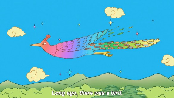
We open with an image of some kind of bird in paradise in flight, an apparent fable from long ago. Already the show’s art design is proving itself distinctive – objects are conveyed basically all in flat colors, excepting the ostentatious color gradient used for this bird’s rainbow coat (or subtle tricks like these slightly lighter mountaintops, gesturing towards the presence of snow). Forms are naturally fluid, echoing the persistent outline redraws that made Helvetica Standard’s characters feel so amorphous and lively. Outlines are conveyed with variable line weight and in variations of their objects’ colors rather than full black, choices which make those objects seem to integrate more naturally into their environment, and also seem more organic than harshly defined. The overall aesthetic evokes a strong sense of fluidity and playfulness, like we’re watching a children’s sidewalk drawing brought to life
Ishidate boarded both this first episode and the OP, so we’ll clearly be getting an unmediated look at his adaptive vision here
Love these whimsical cloud designs, and also how they’re scattered willy-nilly across the sky, intentionally denying the composition a sense of depth. The previews already demonstrated this franchise’s intent on playing with illusions of depth relative to its flat, unshaded art design
“The bird had a disease that would make it turn into stone upon crashing into a rock.” Arawi’s whimsical-verging-on-stupid storytelling is already proving its charm. This transition to stone is also a neat visual flourish, seemingly conveyed in actual paint smears rather than digital coloring, thus giving the bird a cracked, petrified look
“In some eras it was an object of worship, in other eras a drying rack.” You’d think he’s just free associating this shit, but there is a genuine reliable tempo to his madness, assisted greatly by the characters themselves generally acquiescing to the ridiculous terms of their universe (even if those terms do drive them into frequent hysterical fits)
Holy shit, this digitally-assisted pan in on the city is such a flex. KyoAni can actually pull off beautifully animated movement into depth, and they’ve also been regularly experimenting with these sorts of spinning CG shots – Nichijou itself has a famous one where they pan in and around the classroom, and Euphonium’s OPs more recently employed a similar trick. Here, Arawi’s naturally simplified architectural designs facilitate an equivalent pan in on the entire downtown region
If Ishidate wants to keep pulling off sequences like this, his shift to flat color fills makes all the more sense – these characters are simplified enough that they can be reproduced in CG with practically no visual concessions, beyond losing the squashy-stretchy fluidity of their traditionally animated character acting
Interestingly, rather than madcap comedy, the OP actually focuses on the ordinary beauty and pace of life in the city. Again, considering Ishidate boarded this himself, I’m happy to see he’s prioritizing the slice of life stuff that made Nichijou so emotionally rewarding
And it looks like we have a lesbian confession right here in the OP? Very efficient!
Nichijou was an ensemble piece with a few specific leads, where “the town” as both a community and a physical environment were crucial. It seems CITY will follow a similar formula, with three girls as our primary leads, and then a bunch of tertiary characters who get skits from time to time. It’s an excellent way to simultaneously keep things fresh while emphasizing the focus on community – we are a part of the place we live, we are a part of the people we share it with, and all that is something to be celebrated
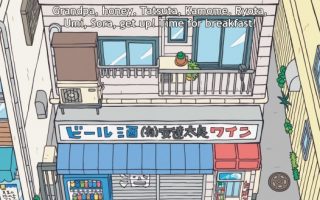
We open the episode proper on a grade schooler telling her big brother his horoscope
Ah, they’re so damn expressive! Just wonderful character acting, combined with charming, simplified shifts in their eyes and mouths. Truly a living comic book – not “panels adapted to screen,” but comic characters bouncing around inside theoretical animated panels
This joke is entirely one of tempo, the long pregnant pause following the brother’s denial of interest, which gives me great assurance that KyoAni have still got the juice. TV comedy is largely based in timing, and nobody does that better than Kyoto Animation
“Makabe Family”
As expected, rather than shading simply by darkening the colors, the production combines flat shading with hatched lines, maintaining its flat color aesthetic and echoing the tools of comic art. A trick that can be used for a variety of different purposes – Fujiko Mine also used it well, in addition to more traditional shading techniques
“Wear it, Tatewaku!” Another Arawi staple, drawing a joke three levels beyond your expectation of surprise. The deer-versus-principle fight embodied this style
Arawi pulls a similar trick with the final punchline, escalating to the point where Tatewaku’s father is chasing him down the street with a boom mic. Crucially, each escalation felt like a natural next step, but when you look back down the street you can’t possibly imagine how you got here
We then head to the local middle school, where a grey-haired man has a paper fly into his face in our establishing shot. This is another fun concept that plays into Arawi’s “everyone is connected” theme – you’ll often see characters from other “stories” in the background of ongoing dramas, because in truth they’re all sharing the same town, all living parallel yet subtly connected lives
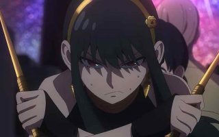
The two middle school girls from the OP are Matsuri and Ecchan
Our form shifts as the two share a canned shoujo moment, the color design embracing watercolor-esque variations in color density. Art design echoing dramatic intent
The two demonstrate Arawi’s fluency in the natural shit-shooting bored friends engage in
A great deal of mundane charm and a dash of absurdism as they prance home, briefly tiptoeing past a giant bear in the process
We then cut to “Sweet Olive Manor,” an apartment complex where a manga artist appears to be having some kind of breakdown
And only at ten minutes in do we jump to Midori Nagumo, our ostensible main protagonist
Oh my god, this food dripping onto the noodles looks so decadent. What delicious, gooey fluidity
Aaand there it goes, right into the case of the old man from earlier
I love when Arawi’s characters all get stuck in the same manic wavelength together, like the chef here asking Midori what to do in a panic, and then countering that the chef can’t run away. The chaos is a sort of unifying force – in spite of our differences, we are all fellow lunatics when the yakisoba’s in the briefcase
Fun flourishes of color design as Midori is flabbergasted by how stupid her boss is
Wonderful contrast of a gentle, carefree melody and absolute visual chaos as their “plan” is executed, involving a champagne bottle’s cork getting fired into the old man’s head and a second yakisoba making it into the briefcase. I think my favorite part is that I can’t even imagine what this plan would have accomplished even if it were successful
Another gag that relies heavily on contrasts of timing, with the luxurious pan around the characters ending in a perfectly abridged punchline. Having our expectations be so raised and then swiftly undercut is a natural source of humor, playing into the sense of surprise and disorientation that lies at the root of much comedy
Our eventual punchline is actually an unexpected payoff to a prior running gag, as we learn the bag just belonged to Tatewaku in the first place. Crisis averted!
Arawi clearly understands that relentlessly bullying someone who in no way deserves it can be extremely funny, as with Tatewaku here or Nano back in Nichijou. Community also regularly exploited this dynamic
I like this production’s occasional jump to silhouettes for moments of personal confession. I imagine this is echoing similarly silhouetted manga panels, which generally don’t work in adaptation, but actually synergize well with this production’s flat color design
What is even going on with this old man scoping out the restaurant? Well, Nichijou also had too many characters to even begin to explain them in its first episode
Here he at least serves as a playful transition, carrying us from the restaurant to a girl observing the explosions of his machinery. Another natural way to emphasize how all their lives are connected
This hat-clad woman is apparently Wako Izumi
“I’ll sniff some Kaimei ink and calm myself down.” Plenty of this stuff can be broken down in craft terms, but Arawi also possesses a singular gift for preposterous non-sequiturs that feels like a mark of natural comic genius
The consistency of color design for the town’s standard background art actually makes these flights of fancy stand out more
She sorta feels like if Nichijou’s Mai was a perspective character, and thus we were privy to the insane line of reasoning precipitating her every ridiculous action
Having conducted half a dozen calming rituals, she walks to the police box only to find it empty. As with the yakisoba incident, a long buildup to an extremely abridged payoff is classic Arawi
Wako’s journey home revels in this production’s distinct combination of flat color design and depth-rich layouts. What a unique, inviting look
So we finally do get a shift in background color as the sun begins to set, though this too appears to be a stable set of “sundown colors” applied to the whole town consistently, with no uneven shading
I like how the manga artist specifically embraces more archaic forms of manga expression; his gasping face here calls to mind Fujio Akatsuka’s expressions
Midori stops by her friend Niikura, who is busy taking glamour photos of broccoli
Oh my god, Niikura’s line read of “Yes. ME!” is so good
The frame hides Midori’s face as she reflects on Niikura having already found her niche, a classic trick for when a perspective character is unsure of their own emotions
She resolves to do “the most fun thing of all”
Oh my god, the ED is claymation and construction paper. Could this production be any more charming?
And Done
Keiichi Arawi, Kyoto Animation, it is so fucking good to have you back together again, and once again making the most endearing, lovingly rendered animation imaginable. CITY clearly maintains much of what made Nichijou so entrancing, from its focus on an entire community to its instantly likable characters to its preposterous flights of fancy. And Ishidate’s team are bringing Arawi’s nonsense to life with as much energy as possible, realizing a new vision of his art in motion that feels so natural and inviting it seems practically effortless, an effect that itself demonstrates both these animators’ profound individual abilities as well as their ability to work in concert, creating a wide array of unique flourishes that nonetheless all fit within CITY’s distinct aesthetic. What a delightful, incredible show.
This article was made possible by reader support. Thank you all for all that you do.